SOCIAL MEDIA STRATEGY
When it comes to online marketing strategy, an easy first step is to focus on social media. Uber is present on all social media platforms to connect to the millennial who form a major part of their customer base. Uber is deeply aware of its target audience and the ways to engage with them.
SOCIAL MEDIA PRESENCE OF UBER
| SOCIAL MEDIA PLATFORM | URL | LIKES/ FOLLOWERS |
| https://www.facebook.com/uber.IND/ | 22,158,300 | |
| https://twitter.com/Uber | 991000 | |
| https://www.instagram.com/uber/ | 945000 | |
| https://www.linkedin.com/company/uber-com/ | 1010700 |
Let’s get a glimpse of Uber’s Social Media presence through Facebook, where Uber has more than 22M likes. Uber’s Facebook account is more of a broadcasting account where it reveals all the latest offers and deals.
Uber’s content comprises of
- Video marketing
- Updating Customers
- Repositioning Brand
UBER SOCIAL MEDIA
APPEALING OFFERS
In India, Cricket is not just a game but an emotion and the Cricket World Cup is treated as a festival. So just before the 2019 Cricket World Cup, Uber has titillated customers by offering them a chance to fly to England by earning runs through rides. The highest earner will fly to England to watch the World cup.
FOLLOWING THE TREND
At the time of writing this blog, the Game of Thrones final season has been the buzziest topic to market. A key factor for audience engagement is to follow the trend which connects people, and Uber is doing exactly this.
PROMOTING THE APP
Mother’s Day is always celebrated by showing love, care and affection on social media. Many people surprise their moms with gifts and trips, and many brands use this opportunity to connect with people. Uber doesn’t miss these trends, and shares exciting and relevant details of its upcoming offers and updates in apps. One of the finest example is
Uber app has a feature of sharing your Trip Status. You can now share your current status to your closed ones which will keep you safe and will provide a sense of security. Of course the one who is mostly concerned about your wellbeing is your mom. This is a creative way to advertise with the example of a mom and a daughter and highlight the trip sharing feature.
UBER WEBSITE
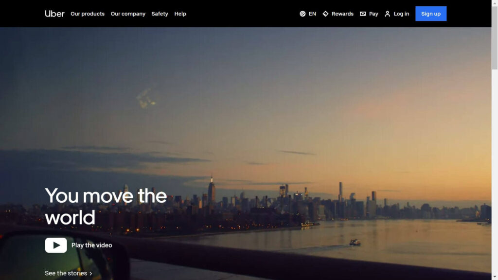
IMAGES MORE THAN TEXT Any advertisement, post or website only has a few seconds to grab the user’s attention. This can be done through simple and clear images. Uber’s website has clear and big images which make it easy to understand the service Uber offers. Customers with warm and pleasant faces are shown. To show that the customers are happy and you are at right place to have a pleasant service of a private driver.

VIDEOS MORE THAN IMAGES
At the time of writing this, the front page of Uber’s website has an emotional and sensitive video of a deaf driver, first transgender driver and a Saudi Arab woman driving. This is all pointing towards a radical change in the world. Videos of human and animal concerns connect with people. Indirectly, they also connect with the brand.
PARTNERSHIPS WITH FACEBOOK
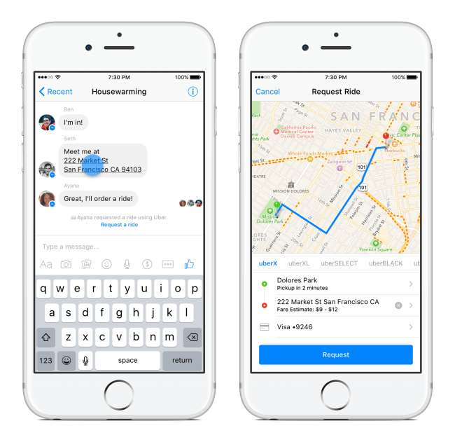
People often make plans on messaging apps. Whether it be a birthday party or a college reunion, marriage reception or office work, FB messenger has been used to plan it all. There is no need to open a separate application to book a ride. You can now book a ride while interacting in the messaging app itself. Just check that your messenger app is of latest version.

SOME AREAS OF IMPROVEMENT
- CALL TO ACTION BUTTONS
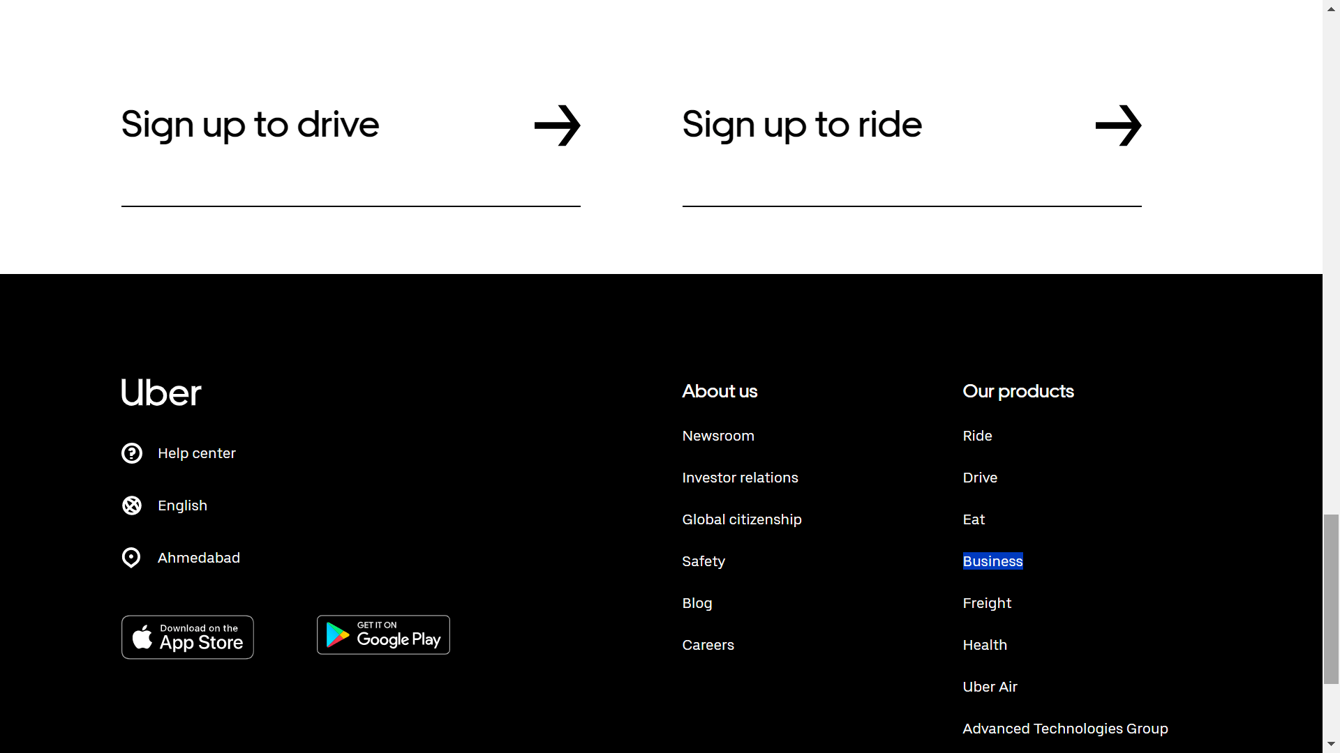
Uber’s website contains very clear and big images. However, it doesn’t have a prominent call-to-action on the first screen that opens up. (Call-to-action buttons are for the actions websites want visitors to take – such as signing up.) Visitors have to scroll down the website to see the Call-to-action buttons. Generally, if a website wants more conversions then its Call-to-action button should be in the zone where it has the highest probability to get clicked – i.e. the very first screen.
First Screen:

Right at the bottom:

Key takeaways:
- Social Media is all about timing. Use the current trends and whatever’s on your audience’s mind and connect it with your brand to get higher engagement.
- Wherever possible, try to highlight your product’s features by socially relevant messaging, such as the Mother’s Day example shared above.
- Have a website with clear messages and relevant images that make visitors easily connect with your brand.
- Give prominent places to the most important Call-to-Action on your webpages, especially your homepage.
About the Author:
Tanushri Saxena is pursuing her MBA from GLS, Ahmedabad. Currently, she is interning as a content writer at WebKow. She enjoys an occasional cup of coffee and is an avid Game of Thrones fan.
